

Clip Arts
Scandinavian Geometric Patterns
Jun
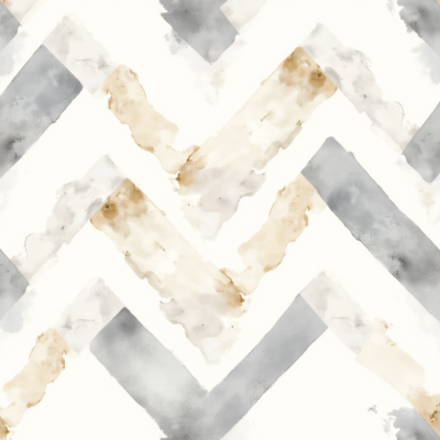
The design world has long been captivated by the understated elegance of Northern European aesthetics. Clean lines, a restricted yet deliberate color palette, and an innate connection to functional minimalism define this style. Among the most versatile offshoots of this movement are Scandinavian geometric patterns. These design elements strip away the noise of overcomplicated illustrations, leaving behind pure, striking shapes that speak volumes without saying too much.
Whether you are an independent creator running a Print-on-Demand (POD) shop, a professional brand strategist, or a hobbyist crafting custom home decor, incorporating these structural forms can completely revitalize your output. But why exactly does this design philosophy hold such a powerful grip on contemporary culture, and how can you leverage it effectively without making your work look clinical? Let’s dive deep into the mechanics of Nordic geometry and unlock its true potential for your creative workflow.
The Anatomy of Scandinavian Design Philosophy
To understand why these patterns work, we have to look beneath the surface. Scandinavian design emerged in the early 20th century across Denmark, Norway, Sweden, Finland, and Iceland. It prioritized two core concepts: form and function. Industrialization meant goods could be mass-produced, but Nordic designers insisted that mass production shouldn’t sacrifice beauty or craftsmanship.
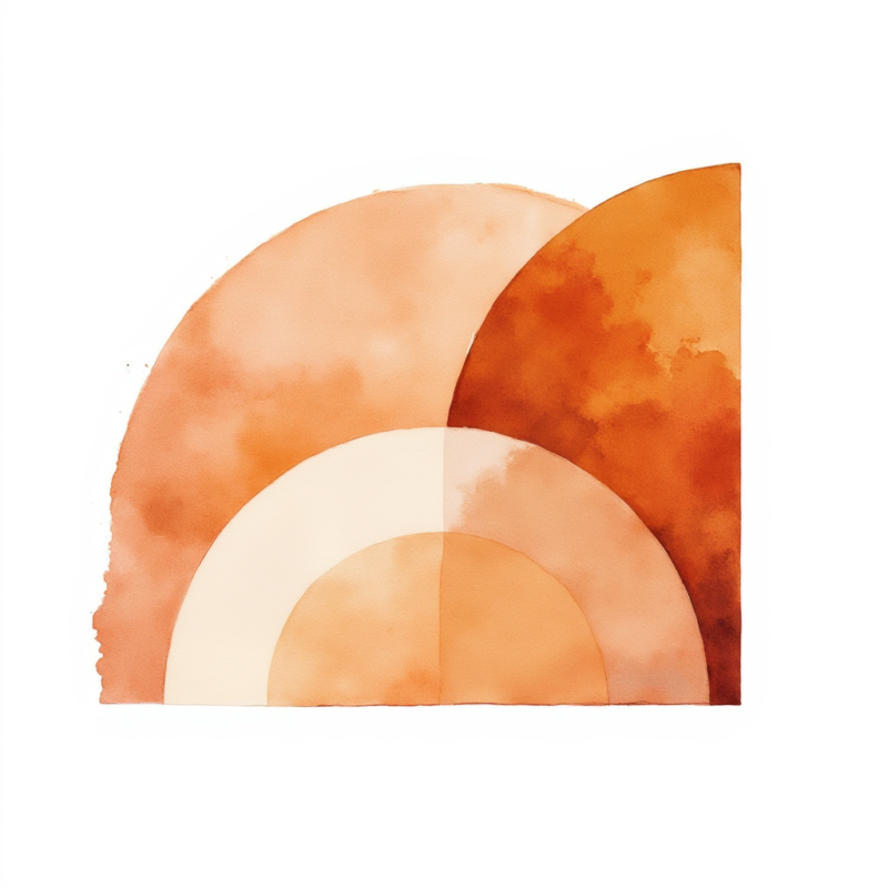
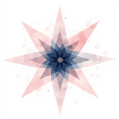
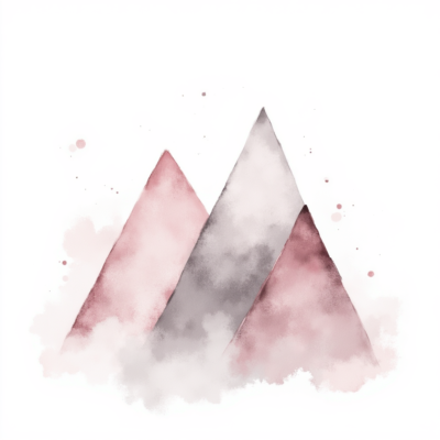
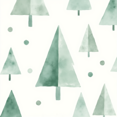
When we look at modern geometric iterations, we see the preservation of those exact values. The shapes are inherently simple—circles, semi-circles, triangles, grids, and soft botanical abstractions. However, their arrangement introduces a dynamic rhythm. The spacing (or negative space) is just as critical as the lines themselves. It gives the viewer’s eyes room to breathe, creating a psychological sense of calm and order.
Another defining factor is the color strategy. Traditional Nordic geometry utilizes earthy tones, soft pastels, or sharp monochromatic contrasts. Think deep forest greens, burnt terracotta, muted mustard yellows, and soft slate grays balanced against crisp whites or deep charcoals. This organic grounding ensures that even the sharpest geometric angles feel warm, approachable, and distinctly human.
Practical Applications: Where to Deploy Geometric Minimalism
The true magic of a well-crafted clipart pack lies in its adaptability. Because these assets are stripped of unnecessary textures and complexity, they can slide seamlessly into almost any medium. If you are looking to expand your digital asset inventory, you can Browse Products on our platform to find curated tools designed to accelerate your creative output. Here are some of the most profitable and visually rewarding ways to use these shapes:
1. Print-on-Demand Apparel and Merchandise
The POD market is incredibly competitive, meaning text-based designs or over-saturated illustrations often get lost in the noise. Geometric patterns offer an immediate visual hook. A single, perfectly balanced abstract arrangement centered on a heavy-cotton cream t-shirt looks like high-end boutique fashion rather than a basic graphic tee. Similarly, wrapping these seamless concepts around ceramic coffee mugs, tech accessories, or canvas tote bags transforms everyday items into desirable lifestyle products.
2. Premium Packaging and Brand Identity
Modern consumers gravitate toward brands that feel transparent, clean, and authentic. If you are designing packaging for boutique skincare, artisanal coffee roasters, or hand-poured candles, minimalist geometry communicates premium quality. By utilizing cohesive patterns across tissue paper boxes, product labels, and thank-you cards, you construct an immersive unboxing experience that encourages customers to share their purchases on social media.
3. Digital Templates and Social Media Assets
If you build presentation slide decks, website banners, or social media templates for clients, you know how challenging it is to find backgrounds that add texture without distracting from the text. A subtle layout of intersecting arches or minimalist lines creates depth while maintaining absolute readability. It provides a structured frame that instantly elevates Instagram carousels, Pinterest pins, and email newsletter headers.
How to Style and Customize Geometric Vectors Like a Pro
Having the right assets is only half the battle; knowing how to position them determines the final quality of your project. If you are ready to update your toolkit immediately, you can Shop Now to grab professional-grade bundles. When working with these minimalist elements, keep these expert styling techniques in mind:
-
Embrace Rule of Thirds and Asymmetry: Do not feel obligated to perfectly center every geometric arrangement. Placing an abstract collection of shapes off-center or cropping them off the edge of the canvas creates an intentional, editorial look.
-
Layer with Texture: To prevent minimalist patterns from looking flat or sterile on screen, overlay a subtle grain or paper texture. This minor adjustment mimics physical printmaking processes like screen printing or linocutting, introducing warmth and tactile depth.
-
Pair with Clean Typography: Geometric shapes pair flawlessly with clean sans-serif typefaces (like Helvetica, Futura, or Montserrat). If you want a more historical, mid-century modern aesthetic, try matching them with high-contrast serif fonts, ensuring your text shares the same geometric weight as the artwork.
Step-by-Step Guide: Integrating Patterns into Adobe Illustrator or Canva
No matter your skill level, utilizing transparent PNG patterns is incredibly straightforward. Let’s look at how to rapidly implement them into two of the most popular design suites available today. If you want to check out complementary resources before jumping in, feel free to Explore More Products on our storefront to build your ultimate design library.
+------------------------------------------------------------+
|             DESIGN WORKFLOW: PATTERN INTEGRATION          |
+------------------------------------------------------------+
|                                                            |
|  [1. Import Asset]  -->  [2. Adjust Layer Scale]            |
|         |                        |                         |
|         v                        v                         |
|  [4. Export File]   <--  [3. Apply Blending / Masks]       |
|                                                            |
+------------------------------------------------------------+
In Adobe Illustrator:
-
Open Your Canvas: Create a new document configured to your desired output specifications (e.g., 300 DPI for physical print products).
-
Place the Image: Navigate to
File > Placeand select your transparent Scandinavian pattern file. -
Convert to Pattern Swatch (Optional): If your file is a seamless repeat tile, drag the artwork directly into your
Swatchespanel. You can now apply this pattern as a fill to any vector shape or background box instantly. -
Fine-Tune with Clipping Masks: Draw a shape over a specific section of the pattern, select both items, right-click, and choose
Make Clipping Maskto restrict the pattern to custom boundaries.
In Canva:
-
Upload Media: Click on the
Uploadstab on the left sidebar and drop your purchased PNG files into the dashboard. -
Position on Canvas: Drag the pattern onto your design space. Because the backgrounds are transparent, you can easily change Canva’s background color canvas to see how the shapes react to different tones.
-
Adjust Transparency: Slide the transparency tool down to 20–40% to create an elegant, ghosted background pattern that won’t overwhelm your foreground elements.

Navigating the Digital Marketplace for Creative Assets
Finding high-quality, high-resolution design components shouldn’t require an enterprise budget. The internet is filled with over-engineered graphic subscriptions, but smart creators look for focused, high-value asset packs that solve a specific problem. For the absolute best value on digital design kits, check out the Latest Tech Deals to secure premium commercial-use assets without the recurring premium cost.
When purchasing digital clipart, always verify three key metrics:
-
Resolution: Ensure the files are rendered at a minimum of 300 DPI (dots per inch). Anything less will look pixelated or blurry when printed on physical products.
-
File Format: Transparent PNGs offer the highest cross-platform compatibility, running perfectly on everything from professional software like Photoshop to mobile apps like Procreate or PicMonkey.
-
Licensing Terms: Ensure the pack explicitly includes a commercial use license if you plan to sell physical merchandise or use the elements in client branding work.
Frequently Asked Questions (FAQs)
What exactly makes a pattern “Scandinavian”?
Scandinavian design focuses on simplicity, minimalism, and functionality. In pattern design, this translates to uncluttered layouts, geometric precision balanced with organic or human-drawn imperfections, and a color scheme inspired directly by natural Nordic landscapes.
Can I scale PNG files without losing quality?
Our high-resolution PNG assets are exported at premium dimensions to handle standard print sizes gracefully. While they cannot scale infinitely like vector files (SVGs or EPS), they provide exceptional crispness for everyday physical merchandise, social media branding, and apparel printing. To discover more options, feel free to View Product Collection on our platform.
Are these patterns suitable for sublimation printing?
Yes. Because they feature transparent backgrounds and clean, high-contrast borders, these patterns are ideal for sublimation workflows, DTG (Direct-to-Garment) printing, and vinyl cutting applications.
Elevating Your Design Aesthetic Instantly
Embracing the world of minimalist art is an efficient way to make your design work stand out in an increasingly chaotic visual landscape. By stripping away extraneous details and focusing heavily on structured beauty, your products and brand assets command attention through poise rather than noise. If you want to see how these elements can instantly refresh your creative pipeline, go ahead and Discover New Arrivals to find the perfect geometric companions for your upcoming campaigns.
Ultimately, great design isn’t about how much you can add to a canvas—it is about knowing exactly when to stop. By introducing clean Scandinavian geometric patterns into your workflow, you tap into a century-old, universally loved design tradition that guarantees your final products look elegant, modern, and undeniably professional. To find more assets that match this design framework, make sure to Find Related Products before completing your creative asset collection.